


MAX2MEN – case study
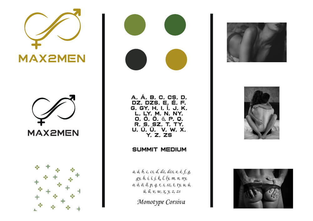
The design of the image of the MAX2MEN potency enhancer product was preceded by detailed research on the image of the competitors available on the market to ensure the distinctiveness of the MAX2MEN.
Defining the basics of the branding
- Color palette: I chose gold and black to radiate masculinity and elegance at the same time. To convey naturalness, I integrated green tones in subtle details.
- Typography: I used an elegant but powerful sans-serif font that conveys confidence in its simplicity. I supplemented this with a handwriting-like font reflecting elegance.
Logo design
- Concept: The logo represents male vitality, strength and efficiency. The emphasis on the word “MAX” refers to increasing performance, while the “2MEN” part refers to the target group in a discreet and modern way.
- Form and symbols: A stylized infinity symbolizes strength and growth. The logo is minimalist and clean to support a professional look.
Packaging design
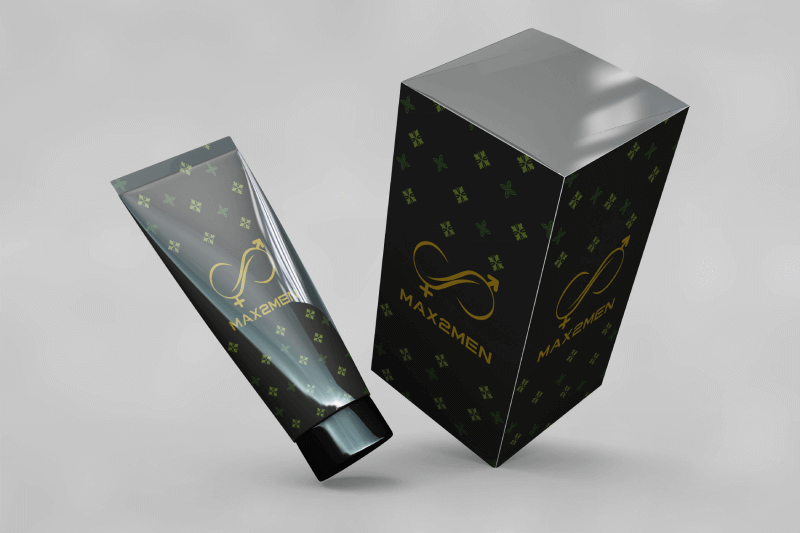
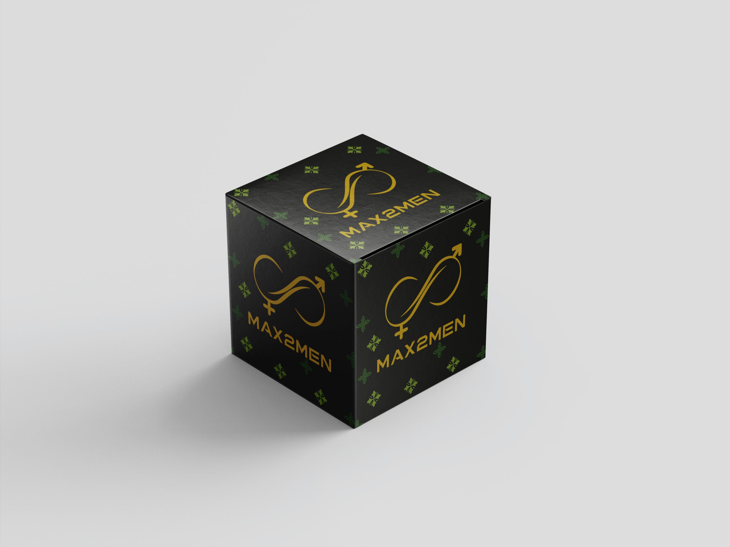
The packaging is in a dark tone that gives a premium feel. The graphic referring to the natural component is displayed as a decorative element in fine details. The logo stands out discreetly thanks to its golden color.
Online and offline appearances
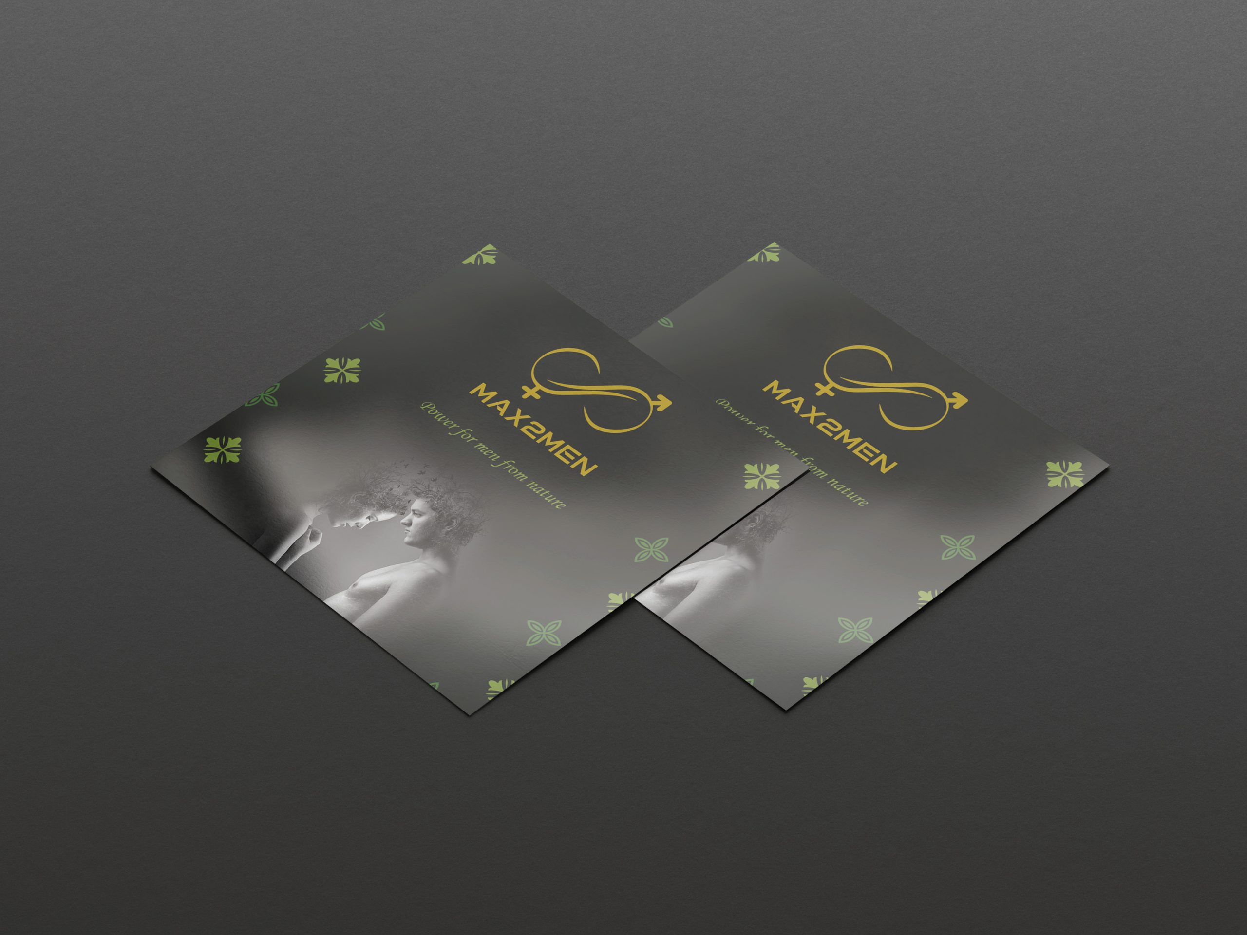
I promote the product discreetly but effectively with modern, close-to-nature imagery and slogans that radiate strength.
The MAX2MEN image is distinctive, natural-based, modern, and masculine, which is in line with the product’s values based on its natural active ingredient and ethical approach.
×
![]()